Living Room Design Ideas with Beachwood Beams
Some homeowners use our beams to make their homes look older - but this incredibly chic, modern living room design demonstrates how they also fit in beautifully with contemporary styles.
Last month, we featured a blog post about faux beams used in a contemporary, industrial-style ceiling project. Continuing with the modern theme, we're excited to share photos of this project, sent in by Meg Foley, a FauxWoodBeams.com customer from Moraga, California.
 Meg writes: "New beams! New lighting, new concrete looking fireplace, new sliding glass doors, new furniture, and new paint color."
Meg chose Custom Beachwood Beams to complement her living room - which is particularly appropriate as her home is just a few short miles away from the beaches of the San Francisco bay.
As you can see from the BEFORE picture, Meg's living room already had good bones. It receives light from two directions, and features a sleek hardwood floor and high ceiling. However, Meg wanted to really make the wide expanse of ceiling pop, and also lighten the entire space by swapping out her dark, leather couches for something more contemporary.
 Meg writes: "Old furniture, older sliding glass doors and unsurfaced fireplace (also playing with paint colors) Original walls were green."
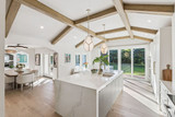
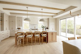
Adding faux beams to a ceiling is straightforward, but the best projects always demonstrate a lot of thought and planning beforehand. In Meg's case, she studied how real timber beams would have been used to support a vaulted ceiling like the one in her living room - so when installed, they look like structural rather than just decorative . This research paid off, as you can see from the pictures.
Meg also credits our team at FauxWoodBeams.com for helping her make a subtle change to the order that made a big difference in the end:
"I just wanted to thank Carol for helping me with every phone call I made back in August, when ordering samples and helping me make the final decision on which beams to order! Thanks to Jessica for placing my order and providing the change I wanted - which was to make the beams wider. I'm totally happy I did - I went from 6" wide like the samples to 8" wide."
 Meg writes: "1st beam going in; Resurfacing fireplace with plaster to look like concrete (going on at the same time as the beams were going in.)"
Two inches might not sound like it can make much of a difference (although anybody who has ever had to parallel park in Meg's nearby city of San Francisco might disagree) but in the case of this ceiling design, they really did. Meg saw that the six inch beams were too narrow to convincingly look structural - and choosing the 8 inch width really made the whole concept come together.
"I couldn't be more thrilled with the overall customer experience and the product received," Meg writes,
"It still makes me laugh when I tell people that they're not real - and I usually have to provide proof, via the samples we ordered and the cuts that we made!"
 Meg writes: "4th Beam going in. Concrete dark, but drying."
The beams really complement the rest of the design changes as well. Meg also darkened the hardwood floors and added a concrete-style facade to the fireplace, which is very stylish and modern. Finally, slimmer and lighter furniture brighten up the entire space and result in a room worthy of any HGTV makeover show.
We're thrilled to be part of Meg's incredible efforts, and it's really exciting to see people use our beams in projects that can pair classic features with cutting-edge aesthetics. Thanks so much for sending these pictures in, Meg - we love them!
 We love Meg's redesign! Our beams look terrific in this light, modern new living room.


