We recently visited the Chicago Avenue home of Frank Lloyd Wright - arguably America's most famous and influential architect. Many of the concepts he pioneered with his \"organic architecture" movement can be used to great effect with our faux wood products; so we wanted to take a moment to explore them.
When Frank Lloyd Wright was born in Wisconsin, in 1867, his mother hung pictures of English cathedrals on his walls and gave him geometric building blocks to play with. In his autobiography, Lloyd Wright claims his mother declared he would grow up to "build beautiful buildings" and if that was the case, he certainly proved that prediction right.

Lloyd Wright's home and studio on Chicago Avenue in Oak Park, IL is open to the public, and preserved to show what the home and business would have looked like in 1909.
Over 500 of Frank Lloyd Wright's designs were eventually built, and today many of those buildings remain as protected properties. His most famous construction was Fallingwater, described as "the best all-time work of American architecture." Eight of his buildings have been nominated to the UNESCO world heritage list, and this year his famous Ennis House in Los Angeles was put on sale for $23M.

Lloyd Wright's home and studio is slightly less impressive than Ennis House and Fallingwater; unless you're a student of architecture. If you are, it's like visiting a living scrapbook of his design inspirations and experimentation; many of which are mirrored in his famous building designs.
We visited the Frank Lloyd Wright Home and Studio this week to learn more about the man's iconic vision - and one of the most remarkable things we discovered was how many of his pioneering concepts would later go on to influence the design advice we give customers when using our faux wood products.
A good first example is in the original studio of his two-story home, which was later converted into bedrooms for his children. Lloyd Wright believed in 'honesty in architecture' and felt that opening up the high ceiling of this room was a better use of the space than an enclosed attic. However, to frame and balance that space he used wooden runners in much the same way many of our customers use our faux beams.

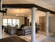
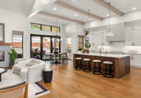
In fact, we've written articles about how beams can be used to break up large ceilings and - somewhat counter-intuitively - they can actually make a room look bigger.

Lloyd Wright similarly used suspended beams to add a 'human scale' to large or tall rooms. This is best demonstrated in the studio he built, which includes an upper story suspended by chains. Lloyd Wright built a network of suspended beams below that to help bridge the gap and better define the work spaces; something he coined as 'breaking the box' of traditional design.

We have a number of design projects which use these techniques - like Caryn's, which used suspended beams to separate her large room.

Suspended beams are also great for adding a more 'human scale' to tall rooms, just as Lloyd Wright used them in his studio.

One of the aspects that defines the architecture of Lloyd Wright best is practicality - although not always so (he actually built a passageway in his Chicago Avenue home to include the branches of a tree, rather than cut it down.) One way he did this was to use design features to conceal functional equipment like radiators and vents. He even inserted a piano into the wall of his family room rather than have the grand piano take up unnecessary room.

One of the most versatile and practical features of our faux wood beams is the fact that they're hollow, and can be used to conceal a host of different practical features such as air conditioning vents, structural supports and wiring. This allows the natural flow of the wood-look to shine and makes our products very much in keeping with Lloyd Wright's philosophy of 'organic architecture.'


One frequent feature of Lloyd Wright's characteristic designs were the use of beams and wood features to suspend lights and other practical elements in places they wouldn't otherwise be able to go - such as these suspended wooden beams at the nearby Unity Temple, which Lloyd Wright designed in 1905.

We recently featured a project which immediately sprang to mind when I saw these practical, yet stylish features - a suspended beam assembly that incorporated an electric fan and light hanging from the center. In addition to being a pretty impressive example of planning and construction, these elements very much mirror the great design inspirations Lloyd Wright envisioned over a century ago.


Another feature of Lloyd Wright's Chicago Avenue home and studio that immediately jumped out at me was the incredible ceiling design in the center of his towering studio. An octagonal roof allows light to come in from all directions, and Lloyd Wright used beams as both practical and aesthetic elements to contrast with the light pouring in.


We've featured many photos over the years of our faux wood beams being used to create similar ceiling fixtures, and it was striking to see a designer from so long ago pioneer an aesthetic element that is still very much a la mode today.

Another design element that Lloyd Wright commonly used was to break up the height of different open spaces - again 'breaking the box' of traditional design. In the nursery this is most clearly scene by reducing the height of the alcove windows; to make the most versatile use of the natural light and create a sense of intimacy where the crib would be placed.

We recently featured a project by designer Andrea Kleiver who used our Custom Handhewn Beams to frame a reading nook for her daughter; utilizing the same technique of 'breaking the box' and framing different areas of an open space for different purposes.


The tour of Frank Lloyd Wright's home and studio was truly eye-opening, and it was fascinating to learn and appreciate all the thought and process that went into defining the aesthetics that continue to be popular to this day.
I think one of the most interesting ways in which our products follow the vision of Lloyd Wright is that they vividly resemble real materials - in keeping with his philosophy of organic architecture - and yet are also practical, versatile and affordable.
From his use of concrete to build Unity Temple, and experimentation with blending magnesite mixed with sawdust to create softer, warmer alternatives to concrete floors, Lloyd Wright was always more focused on what was 'right' for the design of a construction of a home.
We can't claim that he'd have incorporated faux wood into any of his designs if Lloyd Wright were alive today; but I think he'd have appreciated our product and also agreed with many of the stylistic and design recommendations we make right here on this blog.
Shop Related Products


