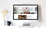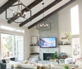
Redesigning a website is a lot like renovating a home: it starts with a desire to update the space and make it more appealing. And when you’re finished, it provides a more comfortable, easy, attractive environment for everyone who visits.
In the 25 years since Barron Designs first went online, home remodeling, interior decorating and home improvement websites have changed dramatically. Staying at the forefront of these trends led us to redesign and consolidate our websites, creating a user experience that is more enjoyable, easier to navigate and better able to provide customers with ways to view and compare products.
Behind the Scenes
One of the most significant changes in our website redesign was combining all of Barron Designs’ individual sites into a single site that showcases all of our product offerings. Originally, our company had three primary websites, fauxpanels.com, fauxwoodbeams.com and fauxcolumns.com. But as business evolved, and customers became more educated, it made sense to combine these sites, for an easier, more integrated shopping experience.
“We didn’t want customers to have to visit our sites separately to find all the products they were looking for,” explains Scott Zeller, digital marketing manager for Barron Designs. “We wanted to provide customers with a more comprehensive buying experience, adding new features like comparison shopping and room-based inspiration, which is more in line with the way people like to shop online.”
Creating a one-stop shop for faux design products was just the beginning. The galleries that showcase Barron’s products have also been upgraded so visitors can easily see how products work together.
If you’re renovating your living room by adding a faux brick accent wall, for example, you may also want to incorporate faux wood beams on the ceiling. In the past, that meant switching sites, and searching for beams to complement your selection of brick. Barron’s new website allows you to see galleries that showcase how the faux wood beams will look in the room, making it easier to find styles that complement each other.
“People aren’t thinking in terms of beams and panels. They’re thinking of the overall look of the room,” says Zeller. “We are changing the way things are presented, so you can see how the room looks as a completed project, and how well everything works together.”
On top of the convenience of the galleries, the site offers a new Shop the Look feature inspired by in-person retail shopping. “If you go into a store like Nordstrom, you’ll see a mannequin that’s completely put together. You think, ‘I want all of that.’ It’s the same idea on our site,” Zeller explains. “If you pick a beam in a certain color, we’ll show you what panels that go with it. It’s another way to improve it the shopping experience for our customers.”
Side-by-Side Comparisons and Customer Reviews
Although online shopping has become commonplace, consumers can still feel overwhelmed when making a final decision for home projects. Will it look as good in your home as it does on the site? How will it really look when paired with a complementing accent?
The product pages are reflective of a more contemporary consumer shopping experience, with side-by-side comparison options, and customer product reviews prominently displayed on each page to make it easier for customers to find the products they want.
“Customers have become more intelligent than ever in the way they use technology, and the way they make their buying decisions,” added Zeller. “This redesign, and the research behind it, has been several years in the making, and it’s exciting to see it all culminate with a website built specifically with the user in mind.”
A Site for Our Times
On top of the new site’s features, interactivity and design improvements, consumers will find it fast and easy to use. Thanks to a more powerful, responsive internal search feature, users can find the products they want faster than ever.
The new site is built for today’s customer, but it’s also ready for whatever comes next. “This platform allows us to be more responsive to our customers’ needs, so going forward, we can evolve the site based on how customers use it,” said Zeller.
Barron Designs is excited to introduce its new, improved site to the world, and to better serve its customers. It is raising the bar, and setting a new standard for the way customers shop. Visit us now at barrondesigns.com, and experience Barron Designs in a whole new way.
Shop Related Products


