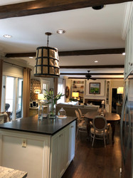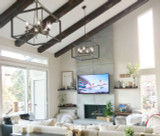
FauxWoodBeams.com customer Jennifer sent it pictures of the remodel of her light and airy home - demonstrating how mixing wood tones can create subtle contrasts for a beautiful decor.
 Custom Timber Beams mixed beautifully with the other wood tones in Jennifer's open-plan kitchen/living room.
I grew up in the 1980s, and that was a period of fashion in which the rules about clashing colors seemed to go right out of the window. I can't remember how many times my mother would dress me in a pastel purple pullover with a salmon (not pink) shirt and I'd go to school looking like two out-of-date Starbursts squished together. It was during those years I learned that the ugliest clash of colors in both fashion and design were sometimes just a few shades apart from one another.
Fortunately it's a rule that most people learned from the eighties, and it's a crime-against-fashion (or decor) that you see increasingly rarely. In fact, for some canny designers, the opposite has come true. They've learned to walk the tightrope between potentially-conflicting colors and come up with some clean, sharp and truly innovative results.
One fantastic example comes to us from Jennifer, who recently added Custom Timber Beams to her home. As you can see from the BEFORE pictures, Jennifer is world-class when it comes to design and one of the most interesting things about the layout and decor of her long, narrow, open-plan kitchen and living room is that it' decorated in colors that many people would assume would clash.
In this case, the walls are painted in a very, very subtle shade of green-white, while the doors, cabinets and brick accent wall are all gleaming white. Likewise, a lot of the furniture is light grey, or contrasted with a dark wood or leather. That darkness is continued with the beautiful hardwood floors.
The mint-green and white is a bold combination - but looks amazing. It's very subtle and classy, and both 'frames' the room by making sure the molding, window frames and cabinets don't blend into the wall color, while at the same time maintaining the light, airy and very 'New England' style of the extended, open-plan room.
When the initial design was finished, Jennifer was understandably proud of her work - but still felt something was missing. While the walls and floor were designed and decorated with those subtle contrasts in place, the ceiling was just a huge expanse of white broken up only by a chandelier and ceiling fan, and recessed lighting.
Jennifer's initial thought was to add beams - but there were a number of challenges that idea posed.
 BEFORE: The expansive white ceiling needed something to break up the space
Obviously, the first is what type of beam to add. Like many designers, Jennifer was presented with the inconvenience and cost of using 'real' wood, and in her case even a manufactured wooden beam wouldn't have been an ideal compromise. Because of the relatively low ceiling height and the existing crown molding, she needed to choose a style of beam that was low-profile, and the smaller a beam gets, the less practical a manufactured 'box beam' becomes.
So instead, she visited FauxWoodBeams.com and we're happy to say that the solutions she was looking for were to be found in many of our products. In the end she chose our signature Custom Timber Beams; demonstrating once again why these are some of our best-selling products.
The beams are made using an innovative injection-molding process that creates vividly realistic copies of real timber beams in a lightweight and durable polyurethane foam. For Jennifer, one of the advantages was that our beams are available in a massive range of lengths, widths and heights and she was able to order the smaller beams she wanted for her project, yet maintain the stunning look of a real wood beam.
Jennifer researched how beams would have been used to support a ceiling like the one in her room, and elected to bridge the horizontal gap between walls. This layout made sense from an architectural standpoint: In a real timber-framed home, narrower beams would have crossed over the breadth of the ceiling, as the much larger beams would have been needed to run the length of the home.
 BEFORE: The wide expanse of white needed to be broken up and 'framed' like the rest of the room.
Once that decision was made, installation was straightforward. Jennifer first measured the length of her room and worked out equidistant mounting points for all her beams. Conveniently, the actual ceiling studs beneath the drywall ceiling were placed at all the equidistant points she needed them to be, so she could drill mounting blocks into them securely.
Next came the challenging part - trimming the ends of the beams to fit snugly across the existing molding. This was an additional step that most homeowners don't need to worry about, but in Jennifer's case it was a vital one. It would provide the illusion that the beams were extending from the walls of the house, and the molding had been installed around the beams. In reality, the opposite was true! But while I describe this step as 'challenging' it was actually fairly prescriptive. Jennifer used a small left-over section of crown molding to draw the lines she needed on the end of each beam, and then was able to cut them perfectly to shape using regular wood-working tools.
 AFTER: The addition of the beams isn't intrusive, yet really helps bring the whole room together.
And then came installation - which involved simply slotting the hollow, u-shaped beams over the mounting blocks and securing them with screws. From unpacking to cleanup, the whole project took just a fraction of the time anything involving real wooden beams would have done.
And this brings us full-circle to the point of the article: The clash of colors.
Jennifer's room already featured dark wood in the forms of furniture, the ceiling fan and the beautiful hardwood floors. When she ordered Custom Timber Beams, a challenge she faced was making sure the color of the beams matched the existing wood...
...except in Jennifer's case, it didn't. Well, not entirely.
Many of our customers will order our beams unfinished and stain them to match existing wood features, but Jennifer instead chose to order one of our existing colors and accepted that it wouldn't perfectly match the existing flooring or furniture - and just like with the mint-green walls and white cabinets, it was a bold yet brilliant choice.
The dark wood beams and hardwood floors aren't exactly the same shade - but that actually makes them look better together. There's more of a realism and authenticity there - carried over by the furniture, which doesn't all match, but looks in perfect keeping thanks to a general dark wood style. Just like the counter-intuitive pairing of mint-green and white, the blend of clashing wood actually makes the faux beams even more realistic. It's almost like the difference between someone who's 'pretty' and 'beautiful' - beauty comes because of what people might perceive as flaws, not in spite of them. When everything matches too perfectly, it almost looks 'fake.'
Whatever your thoughts on that, you'll agree that Jennifer's ceiling beams are a great addition to her already stunning room - and her bold choice of 'clashing' colors brings things together in a way that matching colors simply never could. Do you agree? Let us know in the comments below.
Shop Related Products


